In this story:
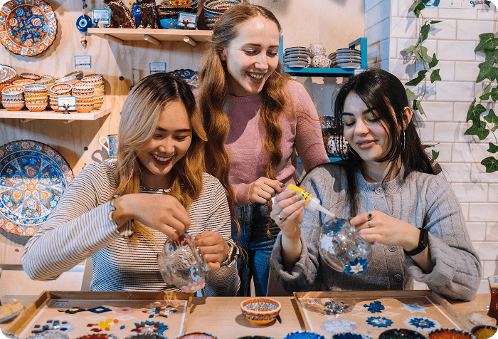
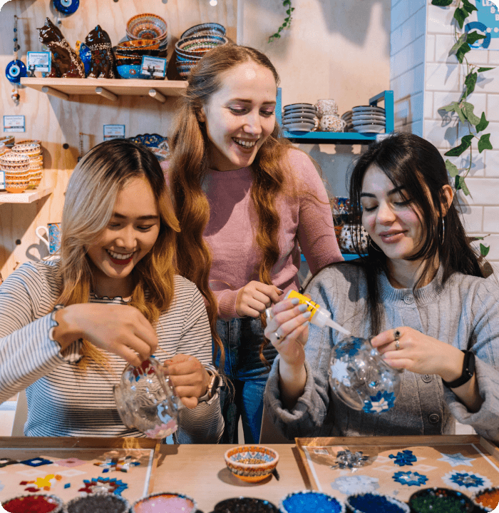
Heading to one of our pottery painting classes across the UK soon? Chances are, you’ve been scrolling Pinterest and Instagram trying to pick the perfect design that’s equal parts easy and adorable. The possibilities are endless and a little bit overwhelming – so we’ve rounded up some pottery painting inspiration for you.
Whether you’re a maximalist at heart, love a bit of floral or fancy going celestial and whimsical – we’ve got you covered. And once you finally pick up a paint brush, you’ll be more than ready!
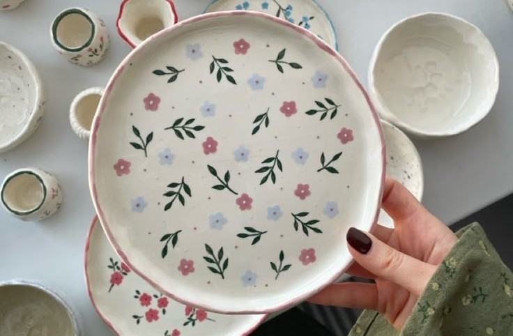
1. Florals
You can’t go wrong with florals. This is a popular choice for pottery painting, with so many flowers to choose from and usually quite forgiving to paint! Go dainty with daisies or vibrant with sunflowers.
Florals are a classic for a reason, and it can be as complicated as you want it to be. If you’re feeling confident, try bold botanical illustrations, or try more delicate brushwork to capture that cottage feel.
Colour palette to try: Blush and dusty rose for romantic florals, cobalt and white for graphic botanicals. Sage, cream and terracotta for a more earthy meadow feel.
Best for: Teapots, mugs and tiles – and everything in between!
Tip: Pick one flower and simplify it to its most basic shape before you start painting – start simple and build detail from there.
2. Minimalist
Sometimes, less is more! Minimalist pottery painting designs are proof that simplicity can still be effective. Think wavy lines, a little green sprig or a dainty heart in the middle of a bowl.
The minimalist style is a good place to start if you’ve never tried pottery painting before – you’re totally removing the pressure to fill every bit of space. You just have to pick a colour palette and master one small design or a repetitive print.
Colour palette to try: Off-white, warm stone, terracotta, sage green, slate blue.
Best for: Mugs, plates and vases – pieces that might live on a kitchen shelf to be admired.
Tip: Take a look at Scandinavian brands like Broste Copenhagen or Søstrene Grene for that clean and cute aesthetic.
3. Maximalist
If you’re more about mixing patterns and colours to your heart’s content, maximalism is calling! Go for overlapping shapes in vibrant colours or trailing vines bursting with fruit and leaves.
Maximalism has been having a moment lately with trends like dopamine decor/fashion – we’re craving more colour and vibrancy, and visuals that make our brains happier! This works so well for ceramics too.
Colour palette to try: Cobalt blue with burnt orange, hot pink with olive green, deep teal with mustard yellow. Basically every single colour ever.
Best for: Large bowls, serving plates, plant pots and vases – pieces that deserve to be the loudest thing in the room!
Tip: The key with maximalism is to commit fully. Half-maximalist looks unfinished; fully maximalist looks intentional!
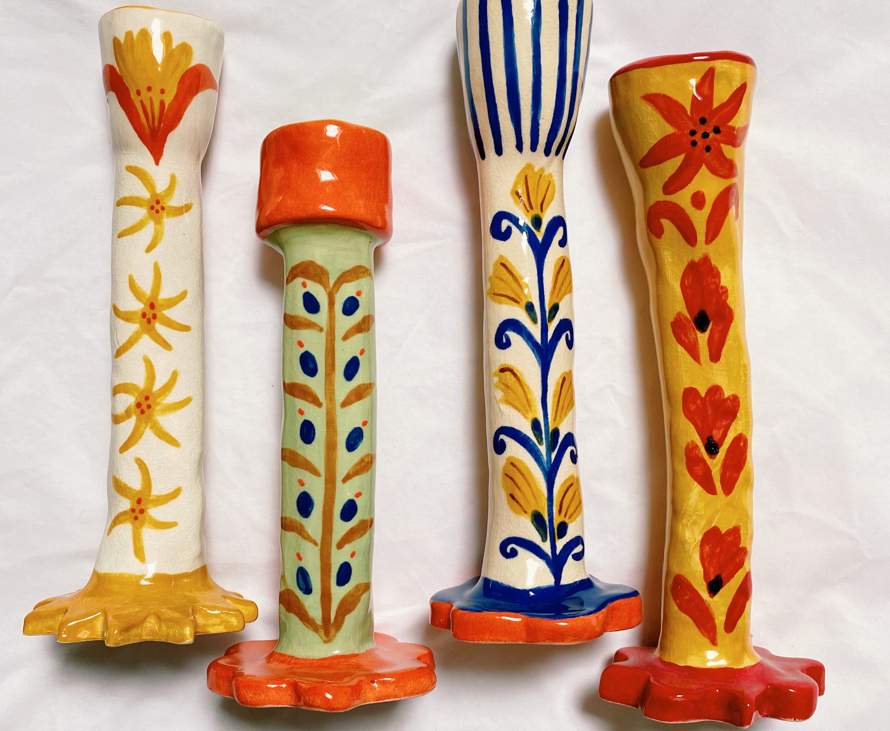
4. Retro and groovy
The 70s are so back! We’re seeing all the retro vibes pop up in fashion, interiors and everything in between – making it a lovely choice for pottery. Picture earthy tones, wobbly flowers and psychedelic suns.
Retro designs are fun and forgiving – any mistakes lean into the charm. If your home already looks a bit like a mid-century time capsule, this is the style for you!
Colour palette to try: Burnt orange, olive green, mustard, cream and warm chocolatey brown.
Best for: Mugs, cereal bowls, small jugs – pieces that feel warm and nostalgic.
Tip: Embrace the wobbly line! Retro designs look best when they're clearly handmade – perfectly neat is not the vibe.
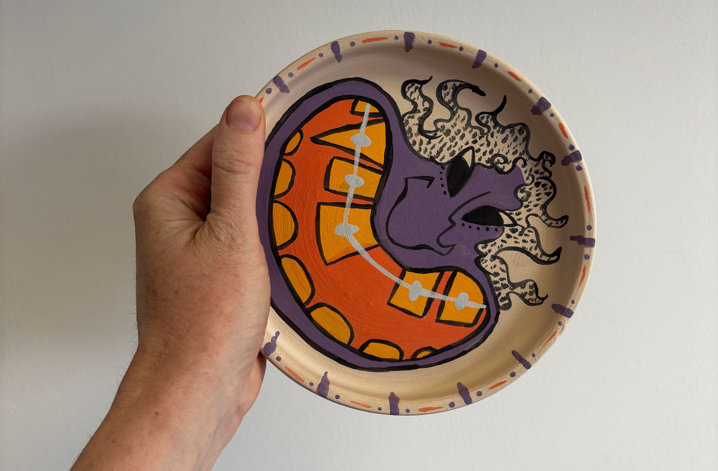
5. Pop culture and pop art
Want a more playful vibe? Pop culture designs range from bold, graphic pop art in the style of Roy Lichtenstein to something more personal – a quote from a favourite film on the inside of a mug or a tiny recreation of an album cover on a plate.
It’s a lovely choice for your first pottery painting adventure because the possibilities are endless – and whatever you paint will feel completely personal to you.
Colour palette to try: Primary red, yellow and blue for true pop art, or go full colour depending on your reference.
Best for: Mugs (a lovely chance for personal references and quotes), side plates, small bowls.
Tip: Keep it graphic and high-contrast – make it pop with your favourite colours.
6. Abstract
Abstract pottery painting designs are often the most freeing. Let go of painting something specific and instead focus on mark-making: brushstrokes, splatters, layers of colour, dragged textures and overlapping shapes.
Think abstract expressionism translated to ceramics. It’s easier to achieve than it looks – and mistakes aren’t mistakes with the abstract style, it’s sure to add a little extra charm.
Colour palette to try: Monochromatic (one colour in many tones) for something sophisticated, or three bold contrasting colours for something more expressive.
Best for: Mugs, bowls, vases. Abstract designs read beautifully on rounded surfaces where the pattern can wrap around.
Tip: Do some sketching with a pencil first but don’t restrict yourself – the abstract style is about letting loose!
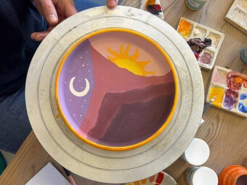
7. Celestial and mystical
Stars, moons, suns, constellations, phases of the moon, astrological symbols – celestial vibes have been everywhere lately. Think night skies, crescent moons and vibrant suns, highlighted with contrasting colours.
The best way to master this style is with a darker background, with your celestial details added over the top in white or metallic gold. Give this a go if you’re still hooked on all things whimsigoth.
Colour palette to try: Midnight navy, deep forest green, rich plum – all with white and/or gold on top.
Best for: Mugs, plates, larger bowls. The celestial style benefits from space to breathe.
Tip: Keep the background wash loose and slightly uneven — and gold or silver metallic glaze is your secret weapon.
A few tips before you paint
Whatever pottery painting designs you decide to go with, a few things will make your session much more enjoyable:
- Bring reference images. Screenshot your inspiration before you go and only pick one or two pictures so you don’t get overwhelmed.
- Start with a light pencil sketch. Most studios will have pencils available. Sketch your design lightly first, then paint over it.
- Glaze looks different wet. The colours you see when you paint will look lighter and more vivid after firing. Your teacher will be able to advise on how colours will change.
- Don't overthink it! The best designs are the ones made with confidence, not caution. Commit to your brushstroke.
Book a pottery painting class near you
Ready to give it a go for yourself? We’ve got the loveliest range of experiences across the UK, right on your doorstep:
- Pottery painting class in Borough, London.
- Pottery painting workshop in Battersea, London.
- Paint and chill painting experience in Manchester.
- Pottery painting experience in Edinburgh.
- Paint your own candlestick workshop in Brighton.
Ready to turn your pottery painting ideas into reality?
Whether you’re dreaming up a groovy retro mug, a celestial serving bowl or a sweet little floral plate, the best pottery painting designs are the ones that feel completely personal to you. Don’t worry about making everything perfectly symmetrical or Pinterest-worthy – the charm of handmade ceramics is in the little quirks and brushstrokes that make your piece one of a kind.
So grab your screenshots, pick a vibe and head to one of our classes across the UK for a wholesome creative day out. Whether you go solo, plan a cute date or catch up with friends over paint and pottery, you’ll leave with something handmade and completely unique to you!